Free Photography Bundle ($180 value): PS actions, LR presets, photo overlays, & print templates!
Get it here.
There are some really great graphic elements going on with photographic trends at the moment. Open a magazine at the cutting edge and you will see borders made of patterns taken from clothes or random colours; overlays adding lines, icons, and effects to images; and text used to make an impact. These techniques can be very effective, and are also very fashionable right now.
To hit the zeitgeist, all you need to do is to add a few of these effects to your own images. A word of caution: normally, these techniques work best when you shoot with them in mind, rather than starting to add them to a shoot which has already been done. You can certainly practice on old images, however. It may also be simpler than you think. All these tips require is basic working knowledge of Photoshop – and in some cases, you may be able to get away with even less than that. Give them a try and you will see an instant difference to your images, and in the feedback that you receive.
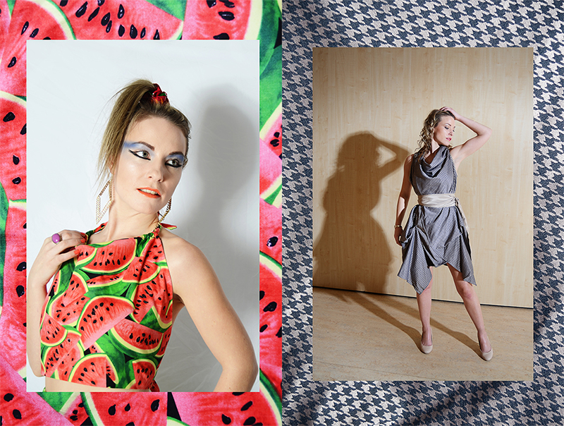
Photos by Rhiannon D’Averc
Using textured frames
This is perhaps the most basic and easy to attempt of all the techniques we will explore here. It is very simple to carry out, particularly if you know what pattern you want to use. One of the key trends is to use the same pattern as you seen on the clothes the model is wearing: this is really easy to achieve by just taking a photograph of the fabric stretched out and close up. You can then use this to create your border. Otherwise, you can use a simple block colour, take a photograph of a texture somewhere else, or download a texture which you are free to use in this context.
Next, open up your border image as a file in Photoshop. Place or drag your central image onto the same file. When you drop it in, you should see options for resizing and moving it around. Make it smaller than the overall file size, maintaining the correct dimensions, so that it fits within the border. You can experiment a little with sizing until you find a look that works for your particular photograph and border choices. Make sure that the image is centred in the frame, then press enter to have it snap down into place. Merge the visible layers and you have your finished image – just like that.
The frame you choose does not have to be the same size or dimensions as your original image, but beware of using something that is many times larger. This will cause your image to look distorted when you scale it up to fit.
Using graphic overlays
Graphic overlays can include lines and shapes, blocks of colour, icons, and so forth. This is fairly easy to achieve with a similar technique to what is described above. You can open your original image first, then drag and drop your overlays into place. If you do not know what kind of overlays to use, you can simply use the shapes that are provided as part of Photoshop’s basic design tools. Make sure that you always place them onto a new layer. This will allow you to change their opacity, move them up and down, change their colour, and do whatever you like to them without affecting the other layers.
You can also download overlays which have been made by professional artists who sell them as Photoshop action packs. These are normally done to create a certain effect – for example, overlaying rose petals to look as though they are part of the scene, adding fake snow, or putting sparkler effects over the image. These overlays will have a more natural look. For a more graphic look, add shapes like triangles, squares, straight lines, and zig-zags. The type of overlay you use should depend on the kind of mood you are trying to create.
Once you are happy with your image, you can merge visible and save as a finished file to use online or print out. Make sure to pay attention to any hidden layers or effects which may be altered by merging.
Adding text
Even though it seems simple, adding text to an image is actually one of the most difficult things you could possibly do. This is because text often looks fake, forced, or awkward when placed onto an image – if it is not done correctly. The best way to learn more about this is to look at magazines, newspapers, posters, and so forth and the way that they use text. What kind of font do they put over images? Does it have a drop shadow? If so, how severe is it? What colours do they use? These considerations will guide you when you are trying to create a good mixture of image and texture yourself.
The choice of font is perhaps the most important part of the whole equation. Try to use smooth and blocky texts which lay naturally on top of the image. If a text is too thin it will be hard to read. Old-fashioned fonts, which tend to be more pixelated at the edges, will stand out awkwardly. Saving the overall image as a JPG may also introduce some further pixilation around the font area, so be wary of that.
If you are having trouble figuring it out in Photoshop, you can also take it down a notch and use an online design suite like Canva. They have lots of templates where you can already see how text should work with images, and you can use these to form the basis of your own designs. This is a great way to learn a lot more about how the design process works, as you will quickly see what works well and what does not.
And more…?
Modern design with photography is all about experimentation. Mixed media is starting to be embraced by magazines for a back-to-basics layout that relies less on computer trickery. Pick up some artistic magazines – thick volumes which often live at the back of the shelf or obscured by other titles in shops – and take some pointers from what they are publishing at the moment.